
How to Photograph and Scan Traditional Art (So It Looks as Good Online)
Your painting deserves better than a yellow, skewed phone photo. How to photograph or scan traditional art with gear you already own — lighting, angles, glare, and the edits that fix the rest.
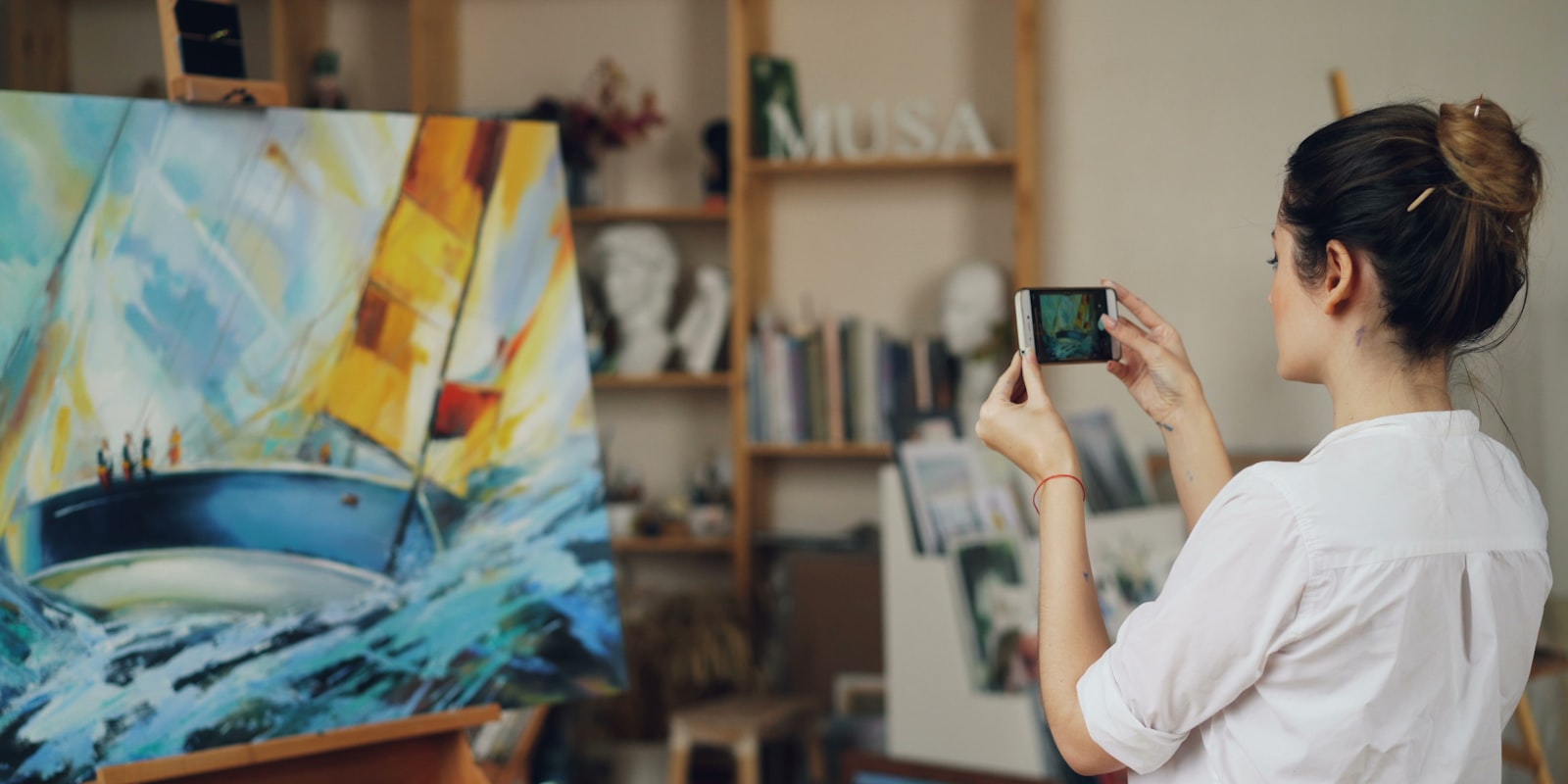
There’s a special heartbreak in spending twelve hours on a watercolour and thirty careless seconds photographing it — then posting a yellow-tinted, skewed, glare-streaked ghost of the real thing. Digital artists export pixel-perfect files; traditional artists have to earn their pixels, and most of us were never taught how.
The good news: gallery-quality reproduction gear exists, and you need almost none of it. A phone, a window, and ten minutes of method fix ninety percent of the problem. Here’s the method — photographing, scanning, and the small edits that rescue the rest.
Photographing: light is nine-tenths of everything
Use daylight, indirectly. The single biggest upgrade costs nothing: turn off the room lights and use a window. Direct sun stripes and blows out; what you want is bright, indirect, even light — beside a large window on an overcast-ish day, or outside in open shade. Overhead bulbs are the villain of most art photos: they’re warm (hello, yellow cast), they’re uneven (one corner glows, one sulks), and mixing them with daylight confuses the camera’s white balance into surrender. And flash — flat, glaring, merciless on paper texture — is never the answer.
Get parallel or pay in skew. Hold the phone so its screen is parallel to the artwork’s surface, dead-on above flat work or square-on to pinned work. Every degree of tilt turns your rectangle into a trapezoid and smears focus across the page. Two tricks help: lay the work flat and shoot from directly overhead (elbows tucked, breath held — or a $2 phone tripod), and use the camera grid overlay to line the artwork’s edges up with the frame’s. Fill the frame, but leave a small margin to crop — cropping to true edges later beats losing corners now.
Then the buttons: tap to focus on the art, drag the exposure slightly down (white paper fools meters into overexposing; faint pencil work vanishes), and take five shots, refocusing between. Storage is free; re-shooting tomorrow’s light isn’t. If your phone shoots RAW, turn it on — white-balance fixes land far better.
Glare and texture (the shiny problems). Gloss varnish, graphite sheen, work behind glass: angle the light obliquely rather than the camera, kill every light source behind you, and for glass, shoot in a dim room with the window off to one side wearing something dark (your reflection is the usual ghost). Heavy canvas or watercolour texture actually likes a slightly raking light — it keeps the surface alive instead of flattening it.
Scanning: when it fits, it wins
For anything that fits on a flatbed — sketches, inks, markers, small watercolours — scanning beats photography: perfectly even light, square edges, and detail your phone can’t match. The settings that matter:
- 300 DPI minimum; 600 for fine linework or anything that might become a print (relevant the day you read the prints-and-merch guide)
- Full colour, always — even for pencil; greyscale mode crushes the subtle warms and cools that make graphite look like graphite
- Auto-enhance off. The scanner’s “helpful” contrast boost eats light pencil and posterises watercolour washes; you’ll do better edits yourself in one minute
- Oversized work: scan in overlapping halves and stitch them (free photo editors merge panoramas happily), or photograph instead
No scanner? A phone plus one of the well-established scanning apps gets surprisingly close for sketchbook work — perspective correction built in. For texture-heavy, glossy or large pieces, the camera remains the right tool regardless; plenty of artists scan small and shoot big forever.
The five-minute edit (not cheating — un-lying)
A short edit doesn’t falsify your art; it removes what the camera added. Any free editor — even the phone’s built-in one — does all of this:
- Crop and straighten to the artwork’s true edges; use perspective/skew correction if you weren’t quite parallel.
- White balance until the paper is honest. The one-slider miracle: if the white of the page reads white, every colour on it falls into place. (Editors with a white-point eyedropper make this one click on a paper margin.)
- Nudge exposure and contrast so the photo matches the artwork sitting next to it — that’s the entire calibration standard you need.
- Resist the saturation slider. Turning your quiet watercolour into neon isn’t reproduction, and the disappointment returns the day someone sees the original — the same honesty rule as any colour decision.
- Export a full-resolution copy and keep it. Post whatever size the platform likes, but archive the master — future-you, assembling a portfolio or a print run, will be grateful.
The habit that makes it painless
Digitising fails as an afterthought and succeeds as a ritual: same window, same time of day, same spot on the floor, every finished piece, before it goes in the drawer. Batch your week’s sketchbook pages in one session. The whole thing becomes a five-minute routine instead of a dreaded chore — and suddenly your traditional work can actually live somewhere online: a tidy portfolio, your gallery on artbase (where traditional media sits beside digital work as a first-class citizen), or wherever your audience is. A painting photographed well once outlives the drawer it goes into.
Final thoughts
Reproduction is a skill, but a small one: indirect daylight, parallel camera, several shots; scan what fits at 300+ DPI with the “enhancements” off; then crop, white-balance to honest paper, match the original, and archive the master. Ten deliberate minutes per piece — and the version of your art the world sees finally deserves the hours you put into the version on paper.
Frequently asked questions
How do I photograph my artwork with a phone?
Use indirect natural daylight (near a window or outside in open shade), lay the work flat or pin it vertically, hold the phone parallel to the artwork so the edges stay square, fill the frame, tap to focus and slightly lower the exposure, and take several shots. Avoid overhead room lights and flash — they cause the yellow cast and glare that ruin most art photos.
Is it better to scan or photograph artwork?
Scan when you can: for anything that fits on a flatbed scanner — sketches, ink, markers, small watercolours — a scan gives sharper detail, perfectly even lighting and square edges. Photograph when the work is too big, has heavy texture or gloss that scanners exaggerate, or is framed behind glass. Many artists scan small work and photograph large canvases.
Why do photos of my art look yellow?
Indoor bulbs cast warm light and the camera's white balance often fails to fully correct it, especially in mixed lighting. Shoot in daylight away from artificial lights, or fix it afterwards with the white-balance/temperature slider — if the white paper in the photo looks white, the colours of the artwork will fall into place.
What scanner settings should I use for artwork?
Scan at 300 DPI minimum (600 DPI for fine detail or anything you may print), in full colour even for pencil sketches, with any auto-enhance or sharpening options switched off. Save as PNG or high-quality JPEG for posting; keep a lossless master file if you plan to sell prints.