
Colour Theory for Artists: The Practical Version
Skip the colour-wheel lecture. The working version of colour theory: hue, value and saturation as three dials, why value does most of the work, and how to build palettes that don't fight themselves.
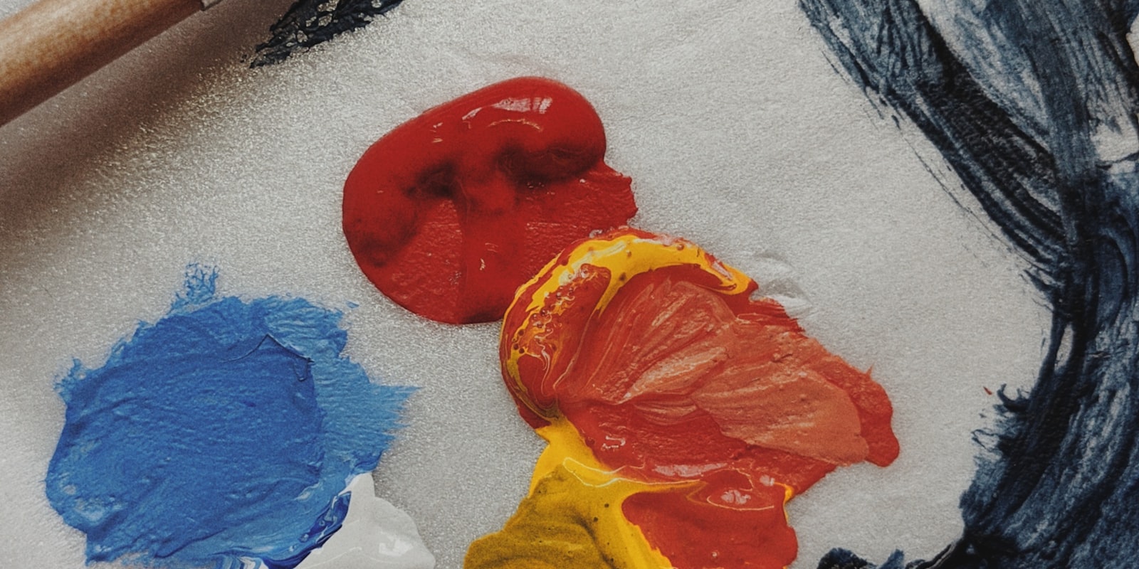
Colour theory has a reputation problem: it gets taught as a physics lecture — wavelengths, wheels, tertiary this, split-complementary that — when what an artist actually needs is a driving lesson. You don’t need to know how the engine works. You need to know what the pedals do.
So here’s the working version: three dials, one inconvenient truth about value, and a palette recipe that holds up. No wheel worship.
The three dials
Every colour you’ll ever place is a setting of three independent dials:
- Hue — which colour: red, teal, violet. What people mean by “colour” in conversation.
- Value — how light or dark it is, independent of hue. A lemon and a banana differ in hue; a lemon in sunlight and a lemon in shadow differ in value.
- Saturation — how vivid or muted: fire-engine red at one end, grey-with-a-red-memory at the other.
The single most useful upgrade in colour thinking is separating these dials. “This area isn’t working” is unanswerable; “the value’s right but it’s too saturated” is a fix. Most digital colour pickers literally lay the dials out for you (hue strip, saturation-value square) — once you see the picker this way, you never fumble in it again.
The inconvenient truth: value does most of the work
Here’s what nobody tells beginners loudly enough: the part of “colour” that makes a piece read clearly is mostly value. Squint at any painting you love — or flip it to greyscale — and it still works: the focal point pops, the depth reads, the shapes group. That’s the value structure doing composition’s heavy lifting (the two topics are joined at the hip — see why some images just work).
Practical consequences:
- Check greyscale early and often. Digital: a black-and-white view or adjustment layer. Traditional: squint hard, or photograph it and desaturate. If it fails in grey, no hue will save it.
- Group your values. Strong pieces usually organise into a few big value zones — light sky against mid ground against dark foreground — with detail inside zones, not fighting across them.
- Muddy = value problem, almost always. “My colours look muddy” is nearly never about hue. It’s a heap of similar mid-values with no structure, or everything at uniform half-saturation. Fix the structure; the mud drains.
What hue actually does: temperature and mood
With value handling clarity, hue is free to do what it’s genuinely for — emotion. Warm hues (reds, oranges, yellows) advance, energise, cosy; cool hues (blues, greens, violets) recede, calm, chill. A scene’s dominant temperature is its mood in one decision.
The workhorse trick: warm light casts cool shadows, cool light casts warm shadows. Golden-hour sun (warm) throws blue-violet shadows; overcast daylight (cool) lets shadows go warm and earthy. Push that temperature contrast even slightly and light starts feeling like light rather than “darker version of the same colour” — it’s the highest-value trick in this entire article.
Saturation: the volume knob everyone leaves on max
Beginner work tends to be loud — every colour vivid, everything shouting. The result isn’t vibrant; it’s flat, because when everything is emphasised, nothing is.
Treat saturation as a spending budget: spend it where you want the eye to go. Faces, focal objects, the glowing thing — those get the vivid colours. Backgrounds, shadows, big areas — muted, greyed, restful. A mostly-muted piece with one saturated accent looks more colourful than a uniformly loud one, which is the kind of paradox that stops feeling like one the first time you try it.
Palettes: a recipe that works
Colour relationships from the wheel, minus the vocabulary quiz: neighbouring hues harmonise (blues into teals into greens — cohesive, moody), and opposite hues energise (orange against blue, red against green — vibrating with contrast). You can build almost anything from those two facts:
- Pick a dominant colour. This is the mood decision. It will cover most of the piece, so make it a livable version — usually mid-value, not-too-saturated.
- Add a neighbour for variety without conflict.
- Reserve an opposite as the accent — small, saturated, aimed exactly at the focal point.
- Distribute roughly 60/30/10. Dominant / neighbour / accent. The proportions matter more than the picks: the same three colours at equal thirds fight; at 60/30/10 they cooperate.
Faster shortcut, zero shame in it: steal palettes. Pull colours from a film still, a photograph, a game screenshot or a painting you love — sample, reorder into your 60/30/10, done. Palette-stealing is a completely standard professional practice, and doing a master study of a piece whose colour you admire teaches more per hour than any theory text.
Three exercises that make it stick
- Two-colour scenes. One warm, one cool, plus their mixes — nothing else. Forces temperature and value to carry everything. (Prompt 20 on the drawing ideas list, and a whole week of the 30-day challenge.)
- Repaint one old piece in a stolen palette. Same drawing, film-still colours. Watching the mood transform while the drawing stays constant is the fastest proof of what hue actually controls.
- Greyscale-first. Paint a small piece entirely in values, then colourise. Feels like cheating; is actually just the dials, operated in the right order.
November’s Huevember challenge — a hue-focused piece a day — is effectively a month of these reps with company; see the challenge calendar.
Final thoughts
Colour stops being frightening the moment it stops being one decision. It’s three dials: value for clarity (check it in grey), hue for mood (mind the temperature), saturation for emphasis (spend it, don’t spray it) — and a 60/30/10 palette assembled from one dominant, one neighbour, one accent. Steal palettes without guilt, squint constantly, and let the wheel stay in the classroom.
Frequently asked questions
What is colour theory in simple terms?
Colour theory is a working understanding of three properties — hue (which colour), value (how light or dark) and saturation (how vivid or muted) — and how colours behave when placed next to each other. In practice it means controlling those three dials deliberately instead of picking colours by trial and error.
Why do my colours look muddy?
Muddiness is almost always a value or saturation problem, not a hue problem: too many mid-values with no clear light/dark structure, or every colour pushed to similar medium saturation. Check the piece in greyscale — if it reads badly there, no hue change will save it. Reserve your most saturated colour for one focal area and let everything else stay muted.
How do I choose a colour palette for my art?
Start with one dominant colour that sets the mood, add a neighbouring (analogous) colour for variety, and reserve a small amount of a contrasting accent for the focal point — roughly in 60/30/10 proportions. Limiting a palette to three or four deliberate choices almost always beats picking colours one by one as you paint.
Is value more important than colour?
For whether a piece reads clearly — yes. Value structure (the arrangement of lights and darks) carries composition, depth and focus; hue mostly carries mood. A good-value painting survives almost any palette, while no palette rescues a broken value structure. This is why artists check work in greyscale.